DETAILS
BRAND: TIFFANY & CO.
Type: Flagship
Location: Melbourne, Australia
Year: 2011
Size: 13,455 square feet / 1,250 square meters
Press: design:retail (formerly DDI),
DesignCurial,
Herald Sun,
InStyle Australia
OVERVIEW
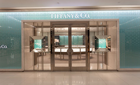
The Melbourne Collins Street location is a timeless, elegant and modern space, taking its inspiration from Tiffany’s iconic brand heritage. Formerly the Bank of Melbourne building, the full renovation transforming the space into the Tiffany & Co Melbourne flagship store resulted in a new aesthetic that combines the drama of theater with innovative retail architecture.
From the street, shoppers are drawn to the store by the double-height façade framed in white Italian marble and illuminated sculpted glass carved with the iconic wheat-leaf pattern. Color-changing LED grazers are used to achieve a saturated blue that enriches the patterned glass.
OVERVIEW II
Christian Lahoude and the team drew inspiration from the city of Melbourne, using shells, pearls and water as creative motifs. A new mezzanine level was constructed to allow for a soaring, 23-foot-high ceiling, opening the space and establishing a light and airy environment. Six white, illuminated curves, reminiscent of theatrical proscenium arches of the Sydney Opera House, span the vaulted ceiling from front to back, defining the retail spaces.
THE CHANDELIER
Christian Lahoude designed the monumental cascading glass chandelier that is central to the design of the store. It extends through a circular cutout from the mezzanine to the ground floor. Crafted by local Melbourne artist Dean Smith, 500 custom-blown pieces of glass in the signature Tiffany Blue are assembled into a stunning focal point.
CLEAN LINES AND CURVILINEAR SPACES
The boutique’s open space and curvilinear displays using the Art Deco fluting detail from the flagship in New York allow the collections to be displayed with refinement, combining horizontal and vertical presentations. A curved, brushed stainless steel staircase connects the two levels. The engagement room is defined by a curved wall and legged curved display cases.
NEW YORK INSPIRATION
The feel of the space is that of an airy New York Park Avenue apartment, achieved through the use of Art Deco motifs and old Hollywood references. Custom furniture was upholstered in richly textured, iridescent fabrics in warm silvers and blues. Tiffany images are displayed in the seating area, referencing the heritage of the brand. Cerused oak cabinets, Italian marble flooring and grey carpeting complete the effect, embodying the beauty and simplicity of design that is in keeping with Tiffany’s overall philosophy.
